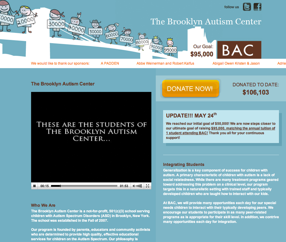
Last Summer, the Brooklyn Autism Center needed a new site designed for their annual donation drive in which the students would walk across the Brooklyn Bridge to celebrate the reaching of their goal. An email template was also designed directing the recipients to this page, and was sent through the client’s own email client using their very curated lists. A follow-up email was also sent as a reminder. This campaign is a testament to the beauty of a great email list. Within weeks they had reached their initial goal of $50k and bumped the donation goal up to $95k, which was then soon surpassed. Talk about a sweet success. There’s nothing like exceeding expectations. The microsite was designed to feature
- a fresh design inspired by the students walking across the bridge
- the donation amount increasing with each submission through the site
- the names of the donors (unless they chose to remain anonymous)
- the video edited for this campaign about the students at the center
- basic, engaging information about the center
- social media links
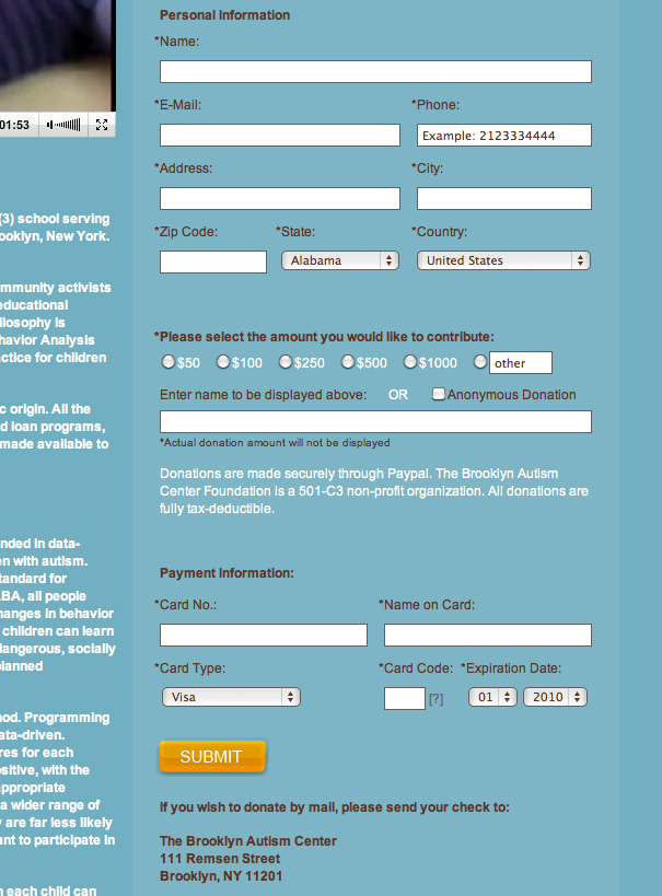
- a donation form connected to paypal pro account
- footer links that directed users to the main BAC site for further information
The landing page was simple and effective in design and showed the kids lined up along the Brooklyn Bridge holding signs with increasing dollar amounts with the skyline at the end of the bridge:  The donation form was thorough and allowed users to select if / how they wanted their names to display on the scrolling Marquee. This allowed donors to donate in the name of someone else:
  For this year’s campaign, we’re updating the page with new copy, a new video, and be designing new email templates. We can’t wait to see how well they do this year!
