In case you didn’t know, Google is rolling out an important update to their algorithm on April 21, 2015.
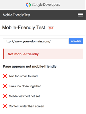
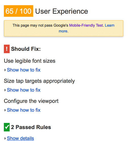
And if your site is not mobile-friendly, you may see decreased search rankings.
April 21, 2015 – Google’s Mobile Ranking Change
Google doesn’t often come out an tell everyone about new updates, but in this case, Google’s Gary Illyes spoke recently at the SMX West Conference about the update.
When asked about the ranking change, Illyes said, “I will say April 21st is a very important day.”
Why the Change?
Why the change? Google, like all other sites, is seeing explosive growth in mobile traffic. This year, advertising on mobile devices is expected to outpace desktop / laptop online advertising. (And Google makes the vast majority of their income through advertising.)

People use their smart phones or mobile devices for more and more. And people tend to hate to use websites that were designed only for a desktop on a mobile device.
So, Google is changing their ranking to take into account mobile devices. Sites that don’t work well on mobile devices will lose ranking for mobile searches.
Do You Have To Have A Responsive Site?
No, your site doesn’t have to be responsive. It just has to work well with mobile devices.
Google’s Gary Illyes reiterated that responsive design does not have a ranking benefit – as long as your site works on mobile devices, you’re in good shape.
Page by Page Basis
Google isn’t going to rank your site on an entire website basis, but rather on a page by page basis.
Takeaway: make sure that your key pages perform well prior to April 21, 2015, including your home page.
Don’t Block CSS and javascript
Make sure that your site is not blocking elements such as your CSS and javascript files; if they are blocked, your site will fail Googlebot’s tests.
But I Don’t Have Any Mobile Site Visitors. Should I Still Care?
Yes, it’s a self-fulfilling prophecy. If your site doesn’t work with mobile visitors, then mobile visitors won’t ever want to come to your site. And Google won’t push them there either.
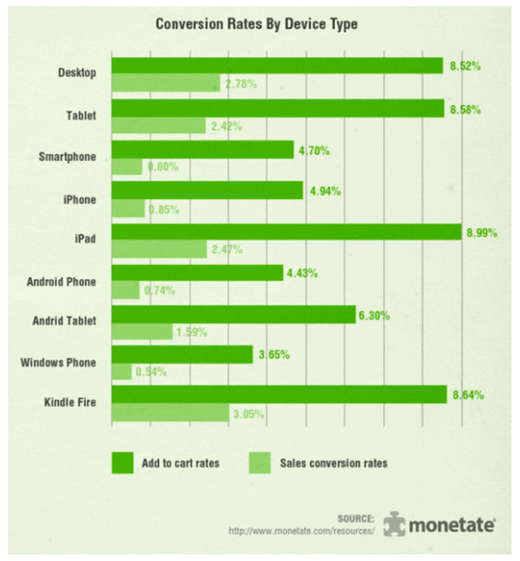
Aren’t Conversion Rates Lower for Mobile Site Visitors?
Yes, because it’s still tricky to type in your credit card info onto a tiny screen.
That said, a lot of purchases start on a mobile device or tablet, and then the end user checks out on a computer with a keyboard.
Especially if you’re used to a keyboard and fast computer, you probably wouldn’t even imagine people would by from a small screen. But they do… because for many people, that’s their primary way to connect to the Web.

Let us test your site for you.
If you don’t know how your site performs on a mobile device, let us test it for you. We can do this at no charge. (Just let me know.)

Thanks,

Jeff Finkelstein
Founder, Customer Paradigm
303.473.4400
Connect Via Facebook >>
Connect Via Google+ >>
Connect Via Linked In >>
Connect Via Twitter >>
We love referrals! Our Referral Promise >> |