eLearning Series
When I want to make a purchase on a website, I want the checkout process to be as quick as possible. I don’t want to have to create an account, go through six slow pages before I can enter in my credit card information, or take more than three minutes of my time.
This week’s eCommerce tip talks about how to make your checkout process as easy as possible for site visitors.
eCommerce Tips: How Easy Is Your Checkout Process?
My recommendation: Simple One Page Checkout Quick, Fast & Easy Checkout.
Don’t you hate it when you have found the product you’d like to buy, only to get frustrated with the checkout process? There are two schools of thought when it comes to shopping cart checkout.
Multi-Step Checkout Process: One school of thought believes that you should have the checkout process divided into neat little steps, that people sequentially walk through:
Page 1. Create account (email address, password)
Page 2. Add Shipping Address
Page 3. Add Billing Address (if different)
Page 4. Choose Shipping Options
Page 5. Enter Payment Information
Page 6. Review Order
Page 7. Success Page
The advantages to this method are that each page is short, and the process is clearly laid out. People don’t get confused. The disadvantages are that it takes a lot of time to go through seven pages on a website. Last week we looked at average page load times for websites. If a site takes 7 seconds for each page to load, for example, the seven pages above will take at least an extra minute of the person’s time. Plus the time it takes to find the “Next >>” button, too. Remember Edna who spent $4.70 each second she was on the site? Seconds do matter.
Single Page Checkout Process: I’m a big fan of the single-page checkout. It appeals to me because it’s quick and fast to go through.
Page 1. Shipping, Billing & Payment Information. (That’s it.)
People are able to easily scroll vertically in their browser, and it saves nearly a minute of time of page loading time. It’s more complicated from a programming perspective, but we’ve tested this on some of the larger eCommerce sites we run, and it’s been wildly successful. The last thing I ever want to do on a website is “Create An Account.” Most ecommerce sites force you to do this, assuming you’ll become a repeat customer (and can remember the username and password that you chose during this step). I have so many usernames and passwords that it’s really easy for me to forget what email address I used. If you use an auto-fill toolbar to fill in your information quickly into forms, then creating an account is not that useful.
Advantages: Quick, Fast, Easy.
Disadvantages: Some people are confused with a one page format. It doesn’t allow people to review their order before their credit card is charged. It’s more complicated to program.
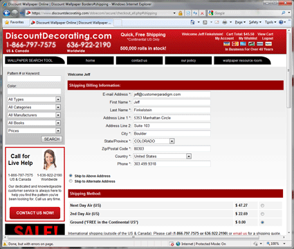
Here’s how the single page checkout works: For the DiscountDecorating.com site, the one page checkout begins with the shipping and billing information at the top. Here’s the top of the page, where people can enter in their shipping and billing information: Here’s the second half of the page, where they can review what they are purchasing and enter in their payment information:

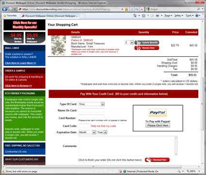
Here’s the second half of the page, where they can review what they are purchasing and enter in their payment information:

Drill Down of Each Part of Single Page Checkout: I want to drill down into each part of the checkout process, as the devil is always in the details. The goal is for someone to spend less than 60 seconds on the single page checkout (assuming they aren’t a hunt-and-peck typist).
For the Shipping & Billing information, we start with their email address. This allows us to contact them if they abandon the shopping cart process (more on this in another week’s tip). For most people, their shipping and billing location is the same. So we start from that assumption, and if someone wants to ship to an alternative address, they can change the radio button and enter in different shipping information. Make sure that your form fields “map” to the auto-fill systems used by Yahoo and Google’s toolbars — so people don’t even have to type in most of their information. This one single tip will make it even faster for people to go through the process. It’s almost the equivalent of paying cash. Based on their zip code, the system calculates shipping charges. The trick is doing this without having to refresh the page.
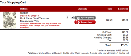
In this case, DiscountDecorating offers free ground shipping in the Continental US, but if you really need your product sooner, expedited shipping is available: When the visitor scrolls down on the page, they’ll see a mini-shopping cart page that displays what they’re purchasing. We recommend including a thumbnail image of each item in the shopping cart, as well as the ability for someone to update the quantity or remove the item on this page (without having them have to return back to their cart, and lose all of the information they added into the form). In this example, we’ve made it as compact as possible, while still giving the user clear buttons that show what to do if they want to change quantity or remove items.

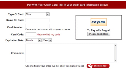
The final step on the single page shopping cart process is for the person to enter in their credit card information. We’ve lined up all of the form fields so that they are stacked in a nice, neat vertical column.If someone wants to pay by PayPal (22% of eCommerce transactions in the US are handled through PayPal), they simply click on a button. (We’ve tried to make this as clear as possible.) We allow people at this point to enter in comments, and then press the “Checkout Now” Button to complete their order:

Not Sure If One Page Checkout Is Right For You? Perhaps it’s not. But without testing it, you’ll never know. Some web designers will want to squash the idea of a one-page checkout, because they might think that scrolling down one long page isn’t elegant. But test it out and see what happens with your sales.
It’s easy to do a test: direct 50% of your traffic for a week to the one page version, and the other 50% to the traditional method. See what works best.And if you really can’t decide… give the customers a choice: Quick, Fast Checkout Returning Customers – Login to Your Account My guess is that most people will choose the first option.
