eLearning Series
Today’s eCommerce tip focuses on doing the math for people. For most people, a 10% discount doesn’t mean anything until you translate it into actual numbers. With over 10 years of testing, I’ll discuss the best ways to display prices on an ecommerce website.
Side Note: Photos of Boulder Published on NBC – 9News: It’s been cold here in Boulder. On Wednesday morning, temperatures dipped to five below zero. I took this photo, and submitted it to the local TV station: A few hours later I checked their site, and saw it was the image they used for their top news story:

eCommerce Tip #5: Do The Math How Much is That Discount?
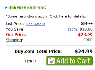
Successful websites do as much work for people as possible – so they don’t have to think. For most consumers, a 12% off discount on a product doesn’t mean much until you translate it for them into real numbers. Buy.com Example: Here’s how the site, Buy.com calculates prices for customers:

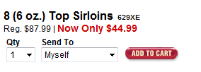
They give the list price at the top, but have a line striking through the price, so you know this isn’t the actual price. Next, they give you what you’ll save ($10.00), and also translate that into a percentage (28%). 28% seems like a big discount, but $10 off on a $34.99 purchase seems even more compelling. Finally, they list the sale price below. It’s quick, fast and easy to understand how much you’ll save and what you’ll pay. Omaha Steaks Example: Here’s how Omaha Steaks displays their discounts:

In this case, I’m forced to do the math in my head to understand how much I will save: $87.99 – $44.99 = $43.00 savings (49%) While Omaha Steak’s example takes up less space on the page, the consumer doesn’t realize how much they’ll save. And they’re unlikely to be able to do this type of math in their head.
Summary: Do the calculations for customers to show them their savings. If you don’t make this effort, they are unlikely to do it as well.
