eLearning Series
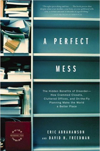
One of my favorite books is called, A Perfect Mess.
The author describes why disorganization can often lead to breakthrough discoveries, and why you shouldn’t feel guilty about having piles of paperwork stacked up on your desk. But even if your office (or computer desktop) is a perfect mess, it’s not always the type of professional image you want to convey to customers. Clutter on your website isn’t just ugly and distracting… it can make it extremely hard for someone to find what they’re looking for.
Good organization and smart use of white space gives the eyes a rest and conveys the message that your company is well organized. When you visit your bank, all of the paperwork (and money) is usually neatly organized and out of view. After all, if the bank just casually tossed the deposit slip with your paycheck into an overflowing pile of paper, you might worry that it might get lost. Your organization’s website is a reflection of your company.
Avoid clutter with these five easy steps:
1. Limit Your Fonts. Does your site look like a ransom note? If you’re using more than two or three fonts or font colors on your site, your site will most likely look sloppy and cluttered.
2. Image Spacing. Do you have enough spacing around your images? If the words run right into the pictures, the site will convey a feeling of confusion and confinement.
3. Avoid Too Many Messages. It’s tempting to include messaging on each and every pixel of the screen. But the best websites draw your eye into one main element, that then compels you to take an action (like reading or learning more, or making a purchase). Some of the best photos for a website use selective focus – so the main subject of the photo (a person, for example) is in sharp focus, while the background is nicely blurred.
4. White Space. Our eyes need a place to rest. Staring at big blocks of text can be hard on the eyes. Remember, computer monitors are set at a 72 dots per inch resolution. Most printers today will print out at 600 or 1200 dots per inch. It’s not easy for people to read a lot of content on a website without having some visual separation using white space.
5. Break Pages Into Smaller Chunks. Avoid the temptation to place all of your content on one single page, where you have to cram it in to fit with a virtual shoehorn. Sometimes it’s easier and makes more sense to break up the content into shorter, more definable sections.

